It’s the end of the year, which means it’s time for my annual project review, including updates to my personal website. I usually try to update it at least once every three months, but 2025 was hectic. This ended up being both my first and last update of the year.
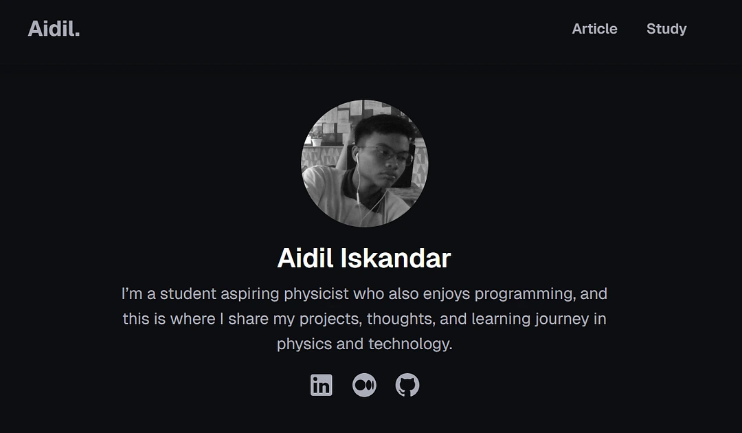
If you’re reading this, the new design is already live. This is the official launch.
(My website's new design)
This is the new hero section of my website. If you’ve seen the old version, you’ll probably notice how different it feels. The previous design was more expressive, heavier on CSS, full of personality. More me!
This time, I went in the opposite direction.
(My website's old design)
There were major changes not just in how the site looks, but also in why it exists and how I want people to use it. Here’s a full breakdown of what changed in the 2026 version of my personal website.
My new purpose
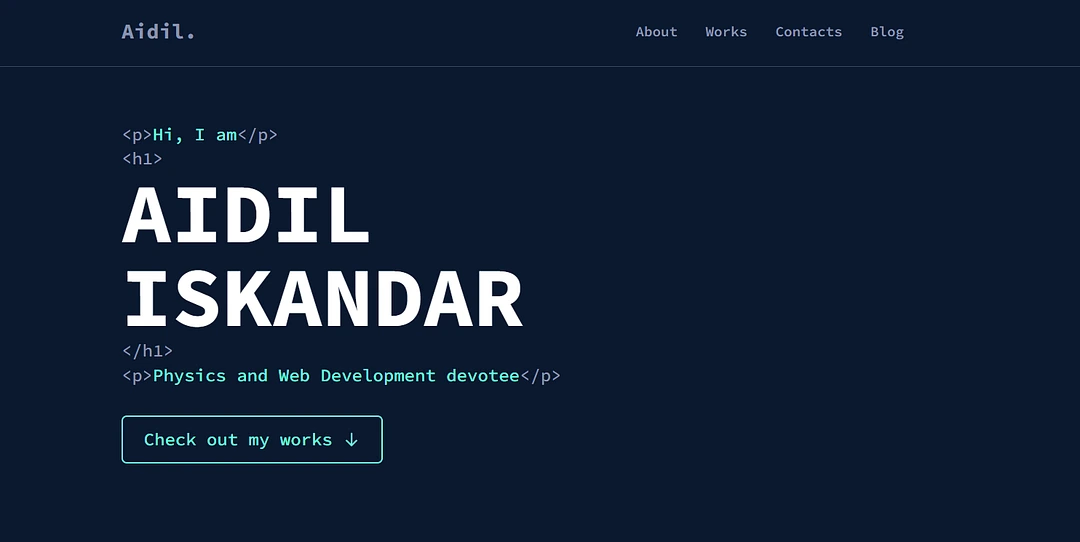
Since the launch of my website, I have treated it as my online portfolio as a web developer. Earlier versions had a dedicated section showcasing the technologies and tools I work with, highlighting the skills I was most comfortable using.
(Skills section in the old design)
For the new version, I removed that section entirely.
Is showcasing your skills important?
Yes, for a portfolio website. That was exactly what this site was meant to be at the beginning. Over time, however, the way I use the site and the reason I maintain it have changed.
I started out positioning myself primarily as a web developer. Building projects and demonstrating technical ability were the main focus. Recently, though, the activity that has remained consistent across all my platforms is writing.
Writing has become the main way I express ideas, document what I am learning, and reflect on experiences. Through writing, I talk about a wide range of topics. These include navigating life as a student in Malaysia, making sense of the post-SPM journey, understanding tertiary education pathways and scholarships, and exploring self-enrichment, personal growth, and everyday reflections.
At the same time, I write about science. Physics remains one of my strongest interests, but my focus goes beyond a single subject. I care about STEM as a whole and about making scientific ideas more approachable. Through essays and articles, I try to communicate complex concepts in a way that feels less intimidating, especially for students who are still figuring out where they belong in science.
In that sense, the website is no longer just a place to show what I can build. It has become a space where I practice writing, advocate for STEM, and slowly grow into a science communicator.
Before this redesign, I also had a separate site called “Link,” inspired by Linktree. Its role was to connect all my online platforms in one place. At the same time, I became more active elsewhere. I shared professional updates on LinkedIn, published personal writing on Medium, and wrote longer, more academic pieces on my personal website.
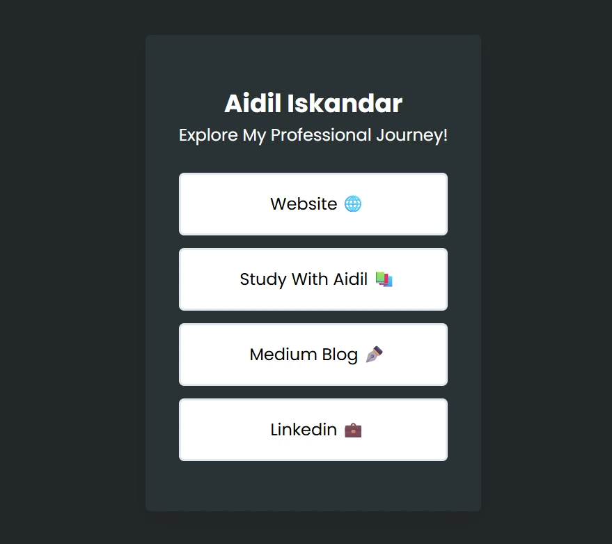
(links.aidiliskandar.space)
As this expanded, I realized that I had branched out too much, even though the core activity across all platforms remained the same: writing.
Was that a bad thing?
Not at all. Each platform serves a different purpose and reaches a different audience. That separation was exactly why the Link site existed. Over time, however, my personal website stopped feeling like the central place that tied everything together.
Because of that, I unpublished the Link website and merged its purpose directly into my personal website. At that point, the site had two roles. It functioned as a web development portfolio and as a connector to my online presence. I chose to move away from a portfolio-first approach.
Since starting my pre-university education, I no longer have the time or capacity to take on collaboration or freelance web development work. Maintaining a portfolio optimized for that no longer reflects how I spend my time or what I want to focus on.
The website is now centered around writing. It features academic and science-related articles, personal reflections, and resources aimed at helping Malaysian students navigate education and life more confidently.
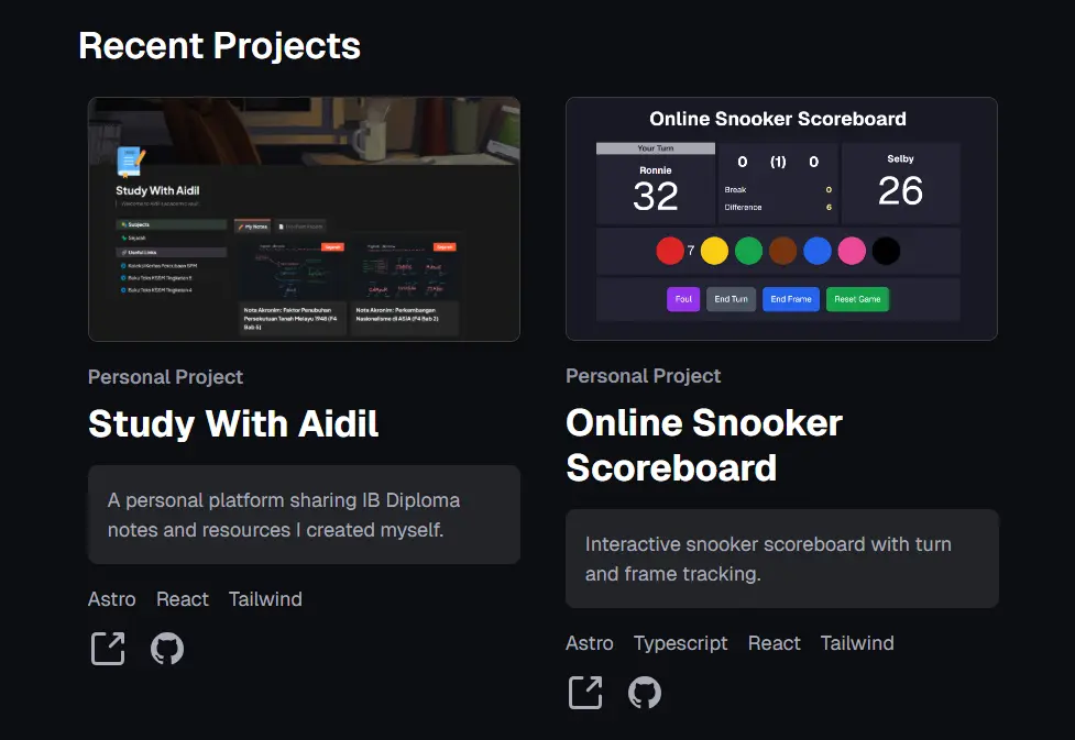
(New design for Featured Projects section)
That does not mean I have abandoned web development project all together. I still feature my projects and clearly state the languages, tools, and technologies used in each one. Instead of listing skills in its own section, I show them through real work.
The site started as a web developer’s portfolio. Now, it is a writing-driven platform focused on STEM, education, and personal growth.
Design Approach
Now that I’ve explained the purpose of the personal website, it’s time to talk about the design approach.
Color
The new design embraces minimalism. I reduced the use of bold colors, such as bright emerald green, and stuck mostly to black, white, and soft accent colors. This is not just for aesthetics but also to make reading more comfortable.
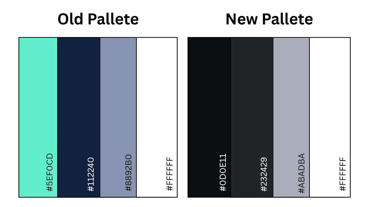
(Old pallete VS New pallete)
Typography
I switched fonts from Source Code Pro to Geist (both from Google Fonts). Source Code Pro was chosen in the past to reflect my programming side, and it worked well with terminal-like design elements. However, for this redesign, my priority is readability. Geist is much easier to read, especially for long-form articles, while still keeping a clean, modern look.
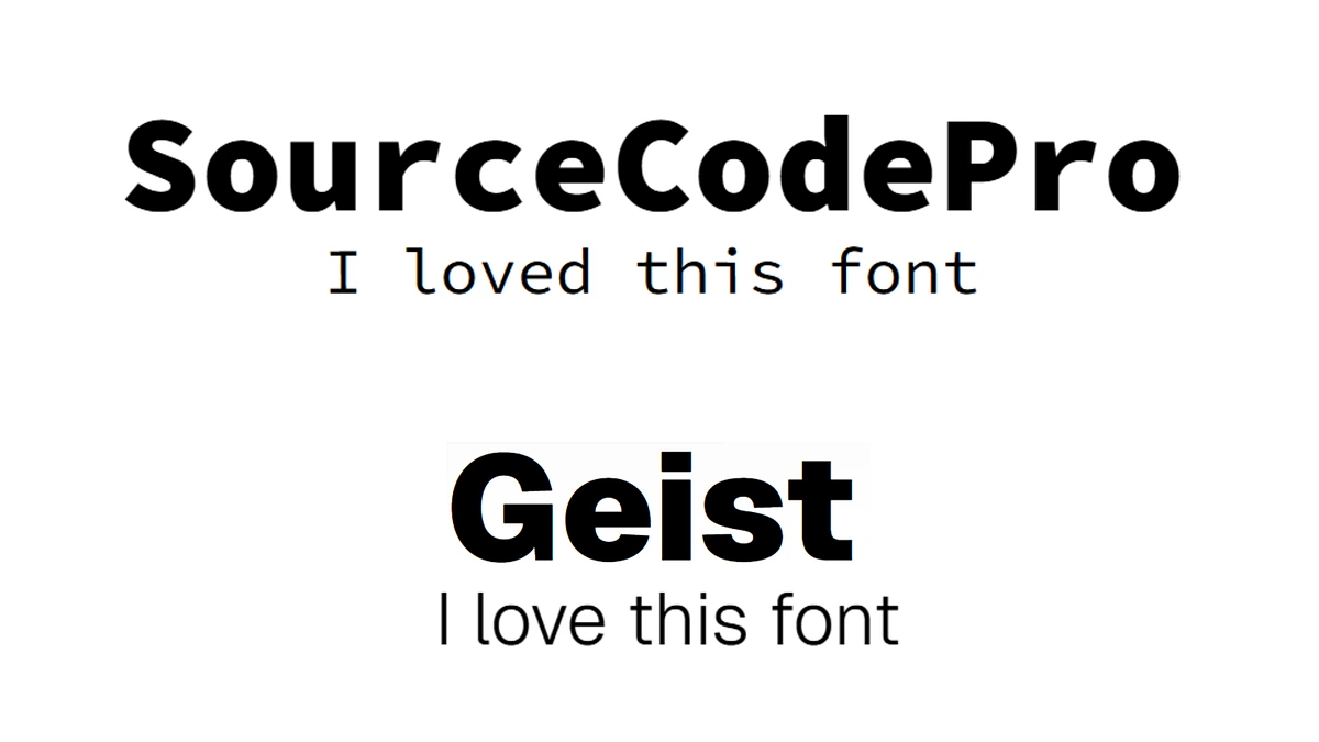
(Source Code Pro VS Geist)
Responsive Design
Just like the previous design, I avoid layouts that require complex effort to adapt to all viewport sizes. The most complex components are cards where I previously used Grid. In the new design, the hero section flows vertically, creating a simple and natural reading order. For the Projects section, I kept the existing component because I liked it, which fits well with the overall minimalistic approach.
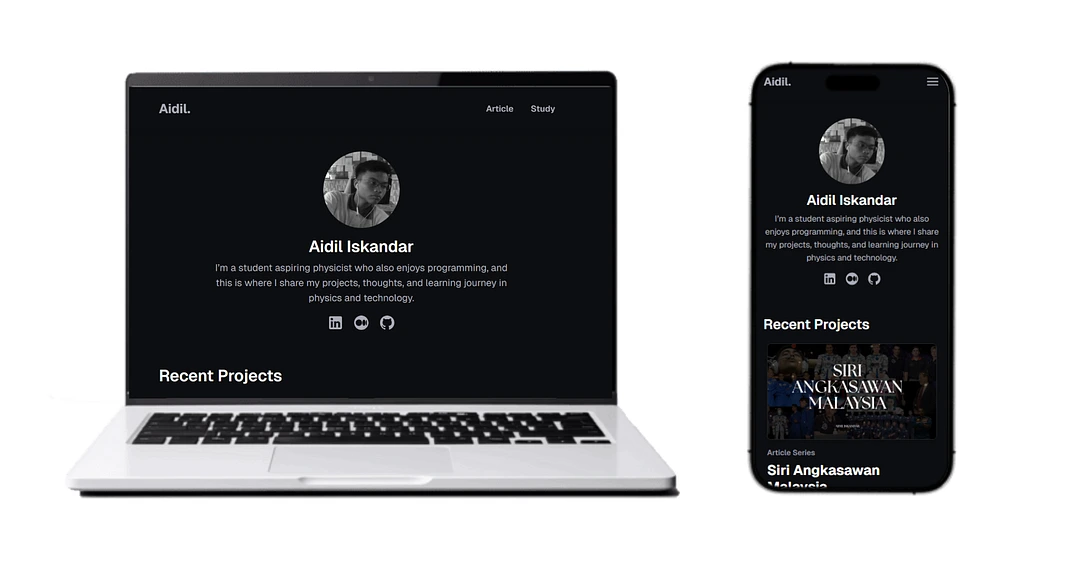
(Responsive design is not a problem anymore)
Minimal Design but More Features
In the previous design, there was no “featured post” section for recent blog or article posts. In this version, I included it to highlight writing-focused content rather than projects.
Integrating this feature required React component islands and Netlify adapters. Each time the homepage loads, it fetches lists from my article page and Medium profile, allowing a filter function to show only academic articles or Medium posts. Despite this added functionality, the design remains minimalistic and straightforward, maintaining a clean and accessible layout.
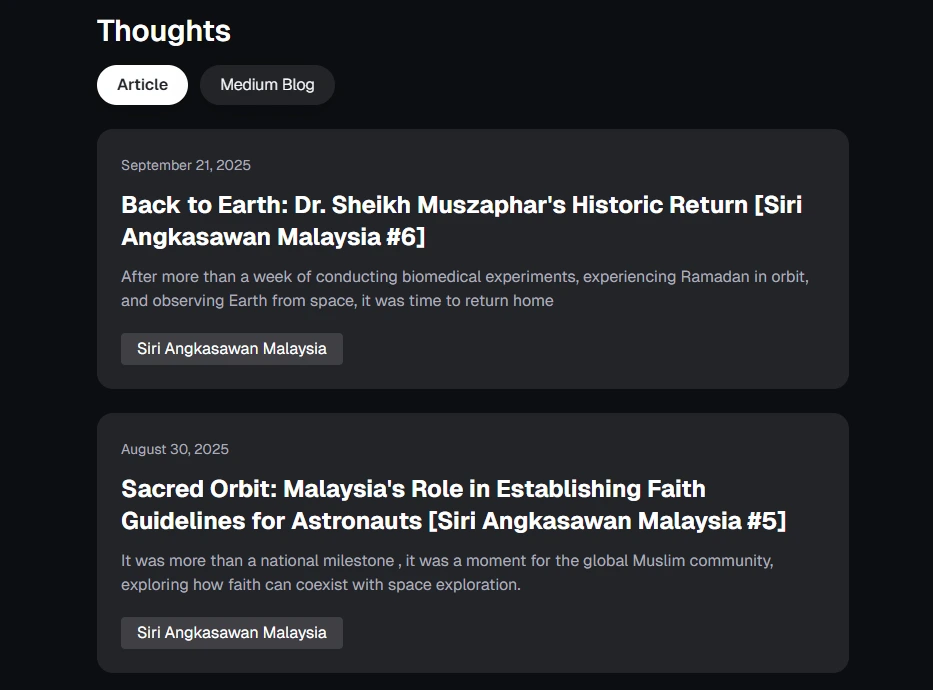
(My Medium blog posts are now featured on the website)
Design Inspiration
For the old design, I was heavily inspired by terminal interfaces. At that time, I really identified myself as a programmer, and the design reflected that. It was what I like to call aesthetically accurate. That’s why I went with the bright green color and Source Code Pro as the main font.
I honestly loved that design. It had personality, it stood out, and it clearly showed the “programmer” side of me.
But things have changed.
My identity now leans more toward writing, education, and academic interests. I wanted the website to feel more professional, elegant, and calm. Something that looks serious without feeling boring, and something that makes sense for long-form reading.
For the new design, I focused a lot on comfort. Softer colors, simpler layouts, and typography that’s easier on the eyes. Instead of trying to look cool or clever, I wanted the design to get out of the way and let the content do the talking.
In terms of inspiration, I took a lot from Tony Carter’s website and the Kyoto Theme. I really liked how clean they felt and how much emphasis they placed on spacing and readability. That influence pushed me toward a design that feels more intentional and more aligned with where I am right now.
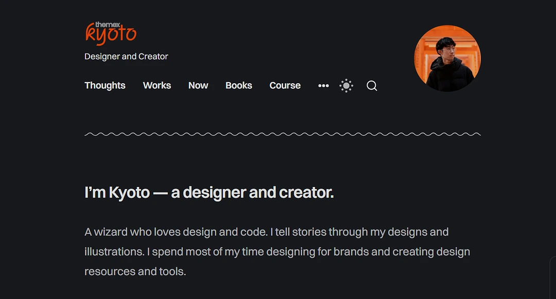
(Kyoto Theme)
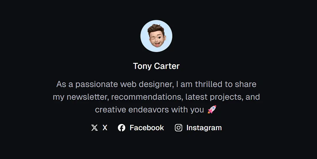
(Tony Carter's Website)
Conclusion
This redesign isn’t as big or dramatic as I probably made it sound, but it still represents a real shift in my life. It reflects a change in how I spend my time, what I want to focus on, and how I want to show up online. I’m choosing clarity over noise, depth over quantity, and writing over constantly building. This version of the website might not be permanent, but it captures where I am right now, and that matters to me.
If you’re reading this, maybe you’re in a similar phase too, trying to simplify, refocus, or figure out what actually matters to you right now. You don’t need a perfect plan or a dramatic reset to move forward. Sometimes small, intentional changes are enough. This website is my version of that, and wherever you are in your own journey, I hope it encourages you to build, write, or create in a way that feels honest to where you are.